The NBA just released 16 new uniforms for all teams that made the 2020 Playoffs, a part of the “Earned” Edition that has been running since the 2018-19 season. No surprise, but the Bucks jersey should be at the top of the list. For context, Nike became the official endorsement partner for the NBA in 2017. Thanks to this, there have been such sweet uniforms that have been created. With this recent release, it gives us all a time to reminisce.
Top 5 Bucks Uniforms in Recent Memory
#5: 2018-19 “Earned” Edition
A tough decision for number five, but it has to be mentioned. The 2018-19 “Earned” edition jersey was primarily worn at home, with white being the main color. Personally, the different shades of green on the right chest with the red Nike check was a perfect touch. Along with “Bucks” vertically down the left side, everything was so coordinated. With a hint of grey on the bottom half, it translated perfectly into the shorts, giving the Bucks a reason to play good since they looked good.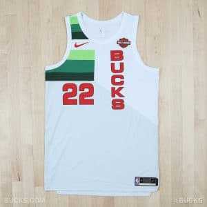
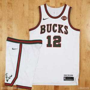
#4: 2017 “Classic” Edition
It feels like these uniforms were not worn as much as they deserved. A tribute to the old-school Bucks colors and font, the “Classic” edition jersey gave the Bucks such a, dare I say, classic look! This design was simple; white, with “Bucks” across the chest in green. Outlined by red, there was also a vintage deer logo towards the bottom of the shorts. In some form or fashion, these should be brought back at some point, without question.
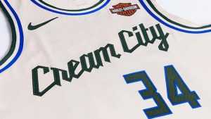
#3: 2019-20 “Cream City” Edition
Instead of going with another white uniform, it is time to change things up. Paying tribute to the “Cream City” nickname, these also sport a classic look, with “Cream City” going across the chest at an angle, with the number centered on the left. With blue and green lining, these were worn for 20 games during the 2019-20 campaign. This was also the second straight year the Bucks had cream colored jerseys. Classic threads combined with modern-day style? Check.
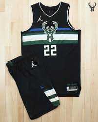
#2: 2020-21 Jordan “Statement” Edition
This year is the first season that Air Jordan has become the official brand of the “Statement” edition uniforms, and I am a fan. Donning the timeless “Jumpman” logo, it gives these unique jerseys another chance to shine. The Bucks, specifically, boast one of the best looks with this one. With a stripe of blue on top, alternating with black, green, white, and gold, the number rests lightly underneath a daunting deer logo in the middle of the jersey. These are a fan-favorite for a reason, and that is why they come in second in these rankings.
#1: 2020-21 “Earned” Edition
Look no further if you need an example of recency bias. In all honesty, these uniforms look better than any in the last few years. The main reason is the green. The Bucks primary color should be praised, and this is a moment that it is. The antlers going down the side with the normal font across the chest is a match made in heaven. With these uniforms being worn on Thursday vs. the Knicks, fans got a chance to see this up close and in person. Based off of Twitter and game commentary, these are a home run.
Debuts on court tomorrow.
All the details of the Earned Edition: https://t.co/DC9tv2mkeG pic.twitter.com/FnOJ8NIN3a
— Milwaukee Bucks (@Bucks) March 10, 2021
P.S. – Whoever took these pictures, blessings to you!
For more Wisconsin Sports content, follow me on Twitter at @donchiarel and follow us @WiscoHeroics1 . To read more of our articles and keep up to date on the latest in Wisconsin sports, click here!

